The much anticipated look-and-feel changes are here! We've continued improving the way the Platform is perceived, along with the way it functions, to make it easier to navigate and use. This is important for new users and equally helpful for our long-timers.
There's lots here, so be sure to read through the details to understand how this affects you!
You Asked for It, We Did It!
We know you're full of great ideas! So check out the Idea Board and add a new idea or vote for the one(s) you love.
- Report titles now display in the title bar of your browser window. This way, if you have multiple reports open at the same time, you can quickly locate the one you want.
- We increased the limit of recurrence records from 360 to 540 records.
- Fixed an issue that displayed an error and would not load a file with an apostrophe in the beginning of the name.
- Fixed an issue where notifications could not be assigned to User Group Members.
- *Schema change* Fixed an issue where subscribers were not receiving some publications. Subscriptions were being deleted from publications that were set to sync nightly. Now, any Publication records with Sync Nightly set to "Yes" will be changed to "No" to correct this.
Look and Feel - We moved things around!
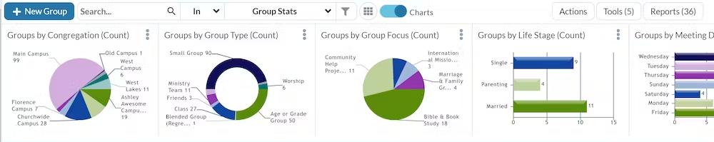
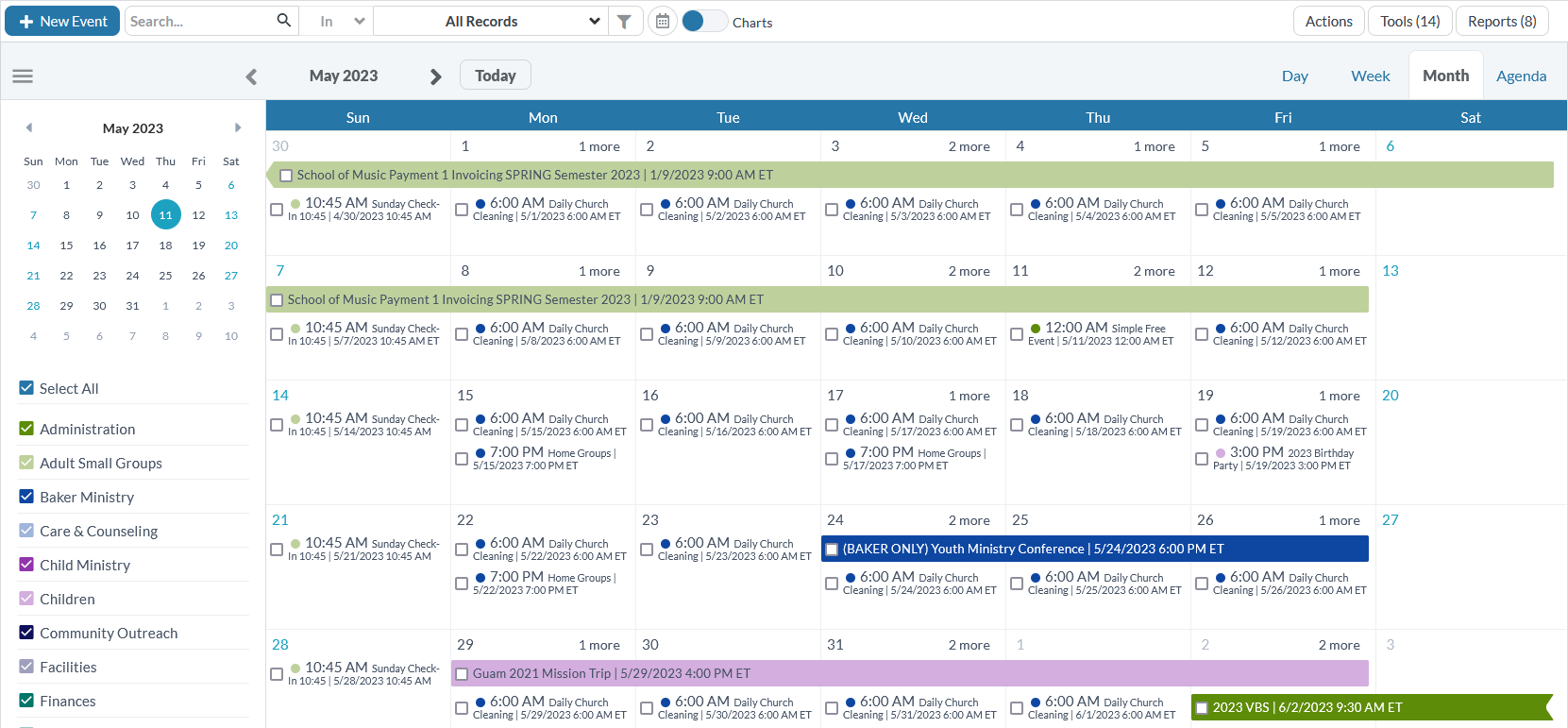
- Fresh paint job for charts and calendars! The new color palette makes it easier to differentiate between items and read charts and calendars at a glance. Here are some examples of the new colors:
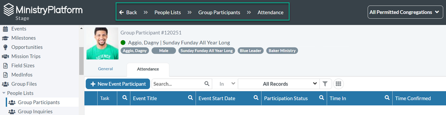
- See where you are in the platform! We added “breadcrumbs” in the header so you can always see the section and page you’re currently on. There’s also a Back button so you can easily navigate to the previous page. Note that this
is only available in the desktop view.
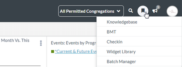
- Bookmarks and announcements in a single click! We moved bookmarks and announcements out of your account sections and into the header.
- Search each column! We changed the down arrow search function to be more intuitive. Now, at the top of each column, you can click the magnifying glass icon to expand the search boxes.
- All together now! The record selection box and actions were hardly noticeable, tucked away in the corner. Now, they’re right next to the associated selection, closer to your field of view.
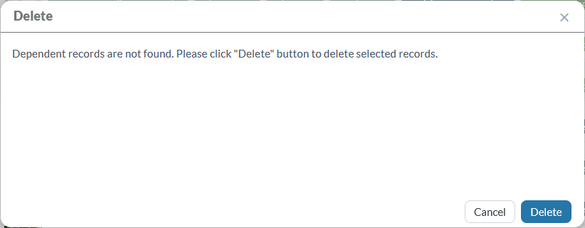
- Overhaul of all modals and messages! You may notice subtle changes to the look and feel of the platform overall. Modals (additional boxes that display on top of your browser window) and message boxes now have rounded corners and fewer lines, giving
them a more modern look. Headers are now bold and use color to indicate what’s important. Informational messages are blue, success messages are green, warnings (which can be reversed) are yellow, and deletions or permanent changes display
in red.
Note that the main action button now displays to the right of the Cancel button in all modals. For example:
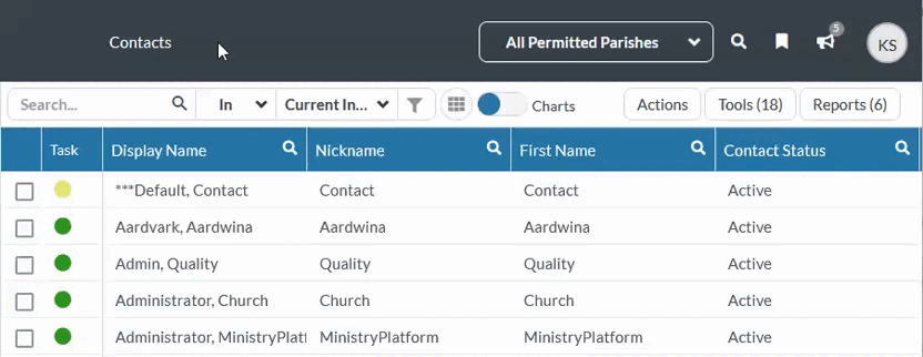
- A little more space! Throughout the platform, we added more space for better readability. For example, you’ll notice items in drop-down lists are more spaced out, and buttons have more padding.
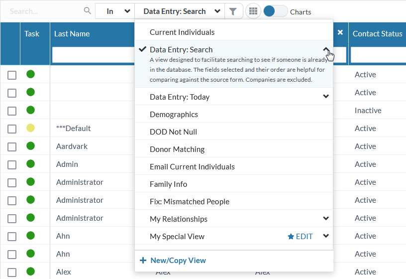
Advanced Search - Now called "Views"
- What would you call the place where you manage views? We thought “Views” was a more accurate description than “Advanced Search”. We’re making this area more friendly so everyone feels comfortable creating their own views.
This is just step one! (Don’t worry, we’ll refer to this function as “Views (Advanced Search)” in the Knowledge Base so you can still search and find what you need.)
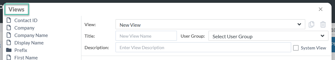
- We added a few things in the view drop-down list, too. From here, you can see each view's description. This is really useful for views that have been shared with others so they can understand what purpose the view serves. These descriptions are collapsible
so you only see it when you need it. Note the 500-character limit, though, so it doesn't get out of hand!
- The view drop-down list also includes a way to edit your personal views. You can easily identify these by the star icon that you know and love. Need a new view? Click “New/Copy View” at the bottom to open the Views modal. From there, you
can start one from scratch or select an existing view to copy and modify.
- Views are still a way to filter information, so the funnel icon still represents that. When you click the funnel, the menu opens and you can add a new view or copy an existing one from there.