![]() Charts
offer an exciting way to visually represent the data that exists on each Page. A SPoC can create Charts for any Page and there is no limit to how many Charts can exist on a Page. Once created, these Charts are available for Users to add to their personal
Dashboards if they have access to the Page on which the Chart exists. If desired, a SPoC may also facilitate this on behalf of a User via the Users sub-page.
Charts
offer an exciting way to visually represent the data that exists on each Page. A SPoC can create Charts for any Page and there is no limit to how many Charts can exist on a Page. Once created, these Charts are available for Users to add to their personal
Dashboards if they have access to the Page on which the Chart exists. If desired, a SPoC may also facilitate this on behalf of a User via the Users sub-page.
Charts work in tandem with Views to create meaningful statistics. It is beneficial to use a layered approach when creating Charts. For example, a date range cannot be specified on a Chart itself but, when layered with a View, the desired result can be achieved.
Note that the Dashboard tab on the Home Page will only appear if the currently authenticated User has added one or more Charts.
Charts are created under System Setup, a restricted area that only a handful of trained and trusted Users should have access to. Below is a step-by-step example of how to create a simple Chart.
![]() A
SPoC is able to assign User Charts via the Users sub-page. This allows a SPoC to generate a handful of Charts on a new hire's Dashboard without the need to impersonate that User. Note: A SPoC may impersonate a user to add a multi-series
chart to their Dashboard; multi-series charts may not be added through the Users tab.
A
SPoC is able to assign User Charts via the Users sub-page. This allows a SPoC to generate a handful of Charts on a new hire's Dashboard without the need to impersonate that User. Note: A SPoC may impersonate a user to add a multi-series
chart to their Dashboard; multi-series charts may not be added through the Users tab.
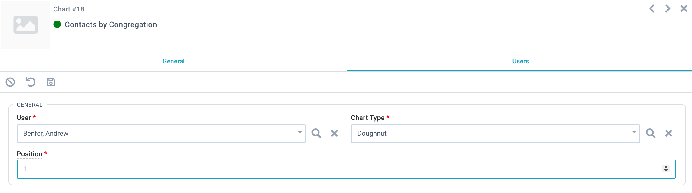
A Chart's position on the User's Dashboard may be set by assigning a numeric value in the Position field. Charts are arranged in a grid with the lowest value displayed first (top left) and the highest value last (bottom right). A User may drag and drop
existing Charts to rearrange in any order, and this will automatically update the Position field.
In this example, Contacts will be sorted according to their Contact Status and the total number of Contacts for each Status will be displayed. Here's how the Chart fields might be populated:
As shown above, when a User adds a Chart to their Dashboard it will display the Chart Title followed by the Aggregation Type in parenthesis. A sub-title also displays showing the Page this Chart is based on and the View used to filter the Chart.
Key Performance Indicators, also known as KPIs, generate a single numeric value.
KPIs are useful for singular, at-a-glance numbers and can often be optimized by layering with a View (rather than pulling from All Records). KPIs support the same Aggregation Types as other Chart Types (e.g. Sum, Count, etc.). Percentages or other "calculations" are not supported. KPIs always display in blue and will not appear in other colors, such as red or green, since these might be perceived as indicating good or bad data.
Because data is not sorted into categories/grouped the Label Field is not considered for KPIs. However, a KPI may be changed to some other Chart Type when an authenticated User saves the chart to their Dashboard so the Label Field should always be considered when creating any new Chart.
Once created a Chart appears on the specified Page and is visible to all Users. However, each User sees the Chart through their own Global Filter (if applied) and any Secured Records are excluded (if applicable).
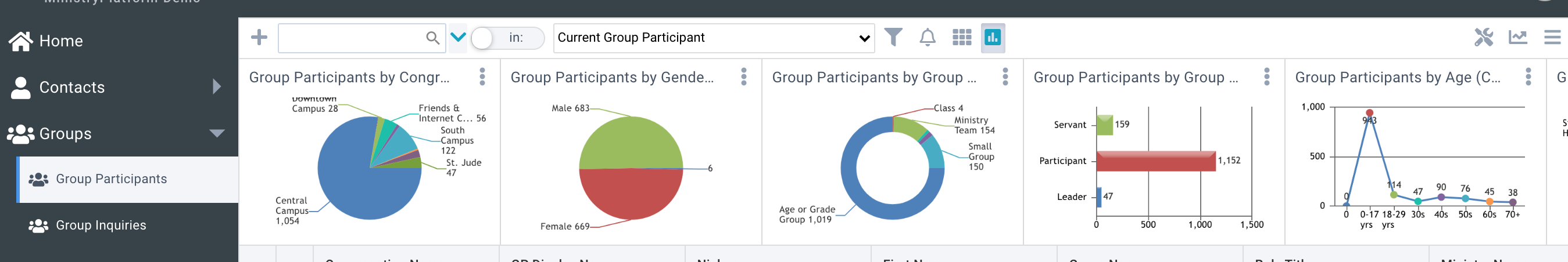
Charts are dynamically filtered by the currently selected View. Note that Charts are not updated based on search terms and will be hidden when a search is executed. Charts are always shown by default but may be hidden by toggling the Charts icon in the toolbar. Once toggled off, Charts remain hidden for the specific Page until toggled on or the browser cache is cleared. Hiding Charts on one Page does not impact other Pages or other Users.
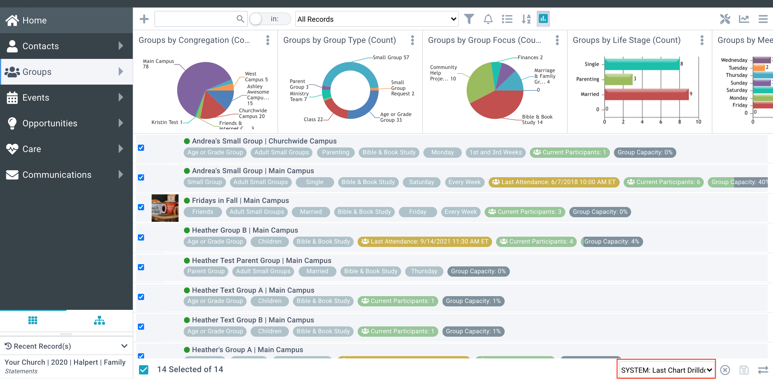
Chart data can become more granular by drilling down on the specific data of interest. Clicking on a section or data point redirects the User to the selection of records that make up that data point entitled, SYSTEM: Last Chart Drilldown.
Please note, KPIs chart types cannot be drilled down into further selections.
In the example below, the user wishes to drill down into the Bible & Book Study groups on the Groups by Group Focus (Count) chart. By hovering and clicking on wedge of the pie chart that represents these groups, a selection appears with the 14 groups that represent that data on the chart. The Selection name indicates that this is the last section of data the user has chosen and is represented is the selection drop-down menu for further use.
Selecting the 3-dot icon in the top right of any Page Chart allows a User to add this Chart to their Dashboard.
The Chart's Default Chart Type is pre-populated but a User may change this to any other Chart Type. This caveat should be kept in mind, especially when creating KPIs - although the Label Field is ignored by the KPI, it will be considered if the User switches the Chart Type.
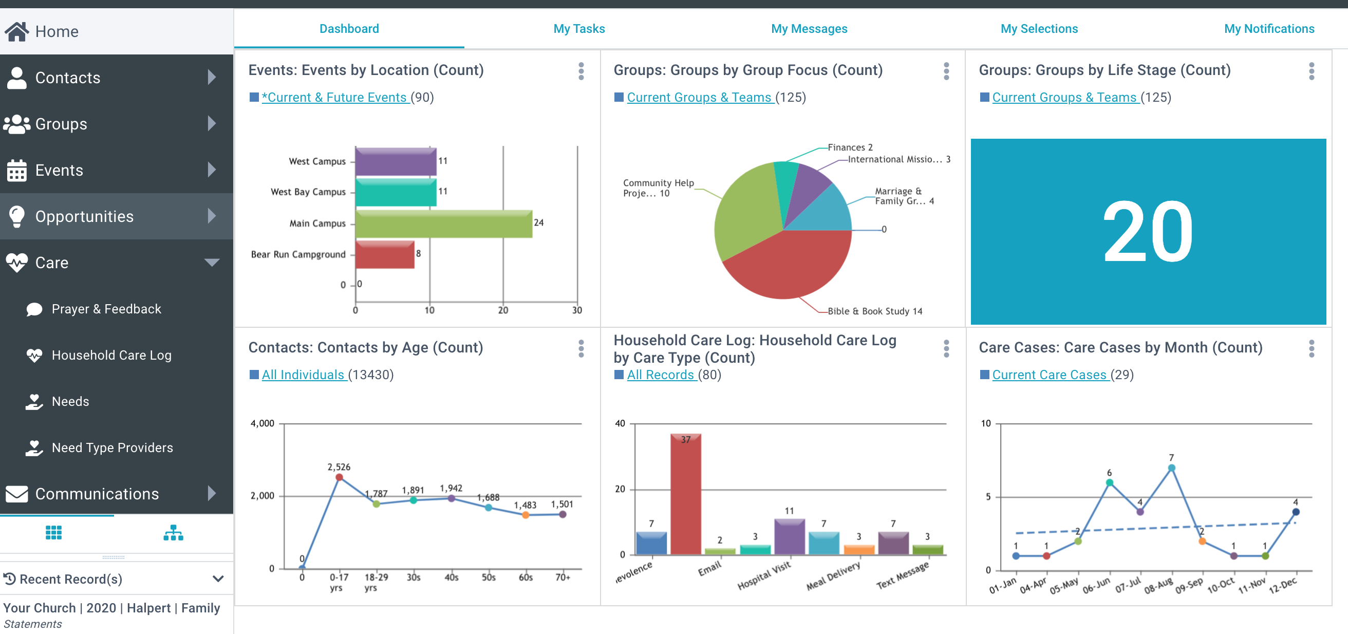
My Dashboard can be found on the Home Page and is the primary tab displayed. Dashboard Charts clearly indicate the Page and View on which they are based and include a direct link back to this View. They also displayed the total record count of this View. Depending on the Chart's configuration, this may or may not be equal to the number of Records this Chart is evaluating but it offers useful insight.
Charts can be edited by selecting the 3-dot icon from the User's Dashboard or Page Chart. From the edit chart dialog, the user can make changes to Chart Type, View Title, and choose whether or not to display Trend Lines. Select the "Save" or "Add to Dashboard" button to finalize Chart changes.
If a Chart with Chart Type "Line" or "Column" is added to the Dashboard, additional configuration is available. For these Chart Types, a User may display up to 3 Views on the same Chart and, if desired, enable a Trend Line for each View.
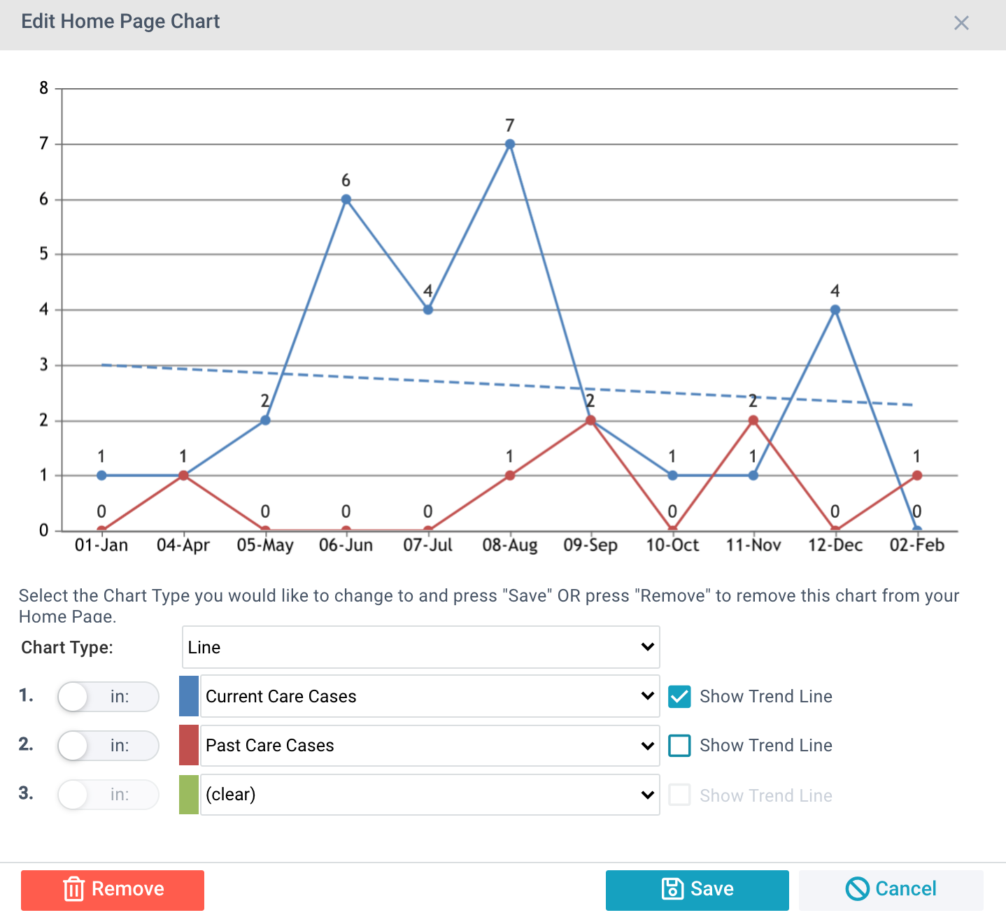
Any View available to the currently authenticated User will display in the View drop-downs. For multi-series Chart Types, a View must be defined for the first drop-down with the current View appearing as a pre-populated value. Views may be defined for the second and third drop-down or these may be set to (clear). If the series should include "All Records" this should be set in the first drop-down. A Trend Line may be enabled or disabled for each View.
Note: If you need to delete a Chart that a User has added to their Dashboard with multiple Views, you will be prevented. The User must first remove the Chart from their Dashboard, then the Chart can be deleted.
Several Charts have already been created and applied to Pages. These can be added to any User's Dashboard. A SPoC may delete charts if they are unwanted from System Setup > Charts.
